Kingston, Ontario, proud home of the Tragically Hip, the Penitentiary Museum, Queen’s university, and enough restaurants to never have to cook again without ever eating anywhere twice. Okay, that may be a slight exaggeration but I’ve lived in Kingston my whole life and I’m still discovering new restaurants all the time. As someone who enjoys tasty eats (duh) but also a quality brand identity, I’ve decided to do a little “investigative journalism” on some of Kingston’s well known restaurants. Or is it just an excuse to stuff my face?
Yes. But I’ll also be doing a bit of review along the way. I want to see how restaurants are representing themselves in a typographic sense. Fine dining is without question a different world from food trucks or casual burger-n-pint type joints but how is branding, and more specifically typography used to set the stage for us food lovers. From their logos to their menus, and everything in between.
The four categories I’ll be looking at are cafés, casual dining, pubs, and fine dining. Hopefully throughout my journey you’ll discover some places to try out if you’re ever in Kingston! Or if you’re just interest in typography and branding, then there’s definitely some spots around town that I’m excited to review. Either way, keep reading for an interesting take on restaurants and how their typography tells a story about the experience just as much as their food. The type and tables are set, cravings guaranteed.
Balzac’s Coffee
The first café I visited was called Balzac’s. There’s an interesting mix of typefaces used on their storefront. A traditionally appealing glyphic serif on the canopy paired with a tracked all-cap geometric sans lets us know they’ve been around a while but are still up with the times.
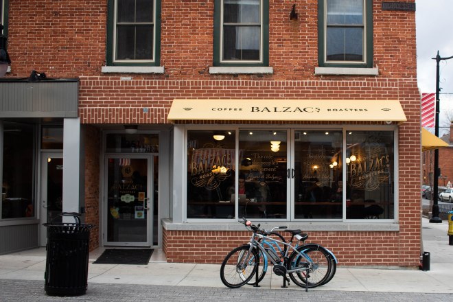

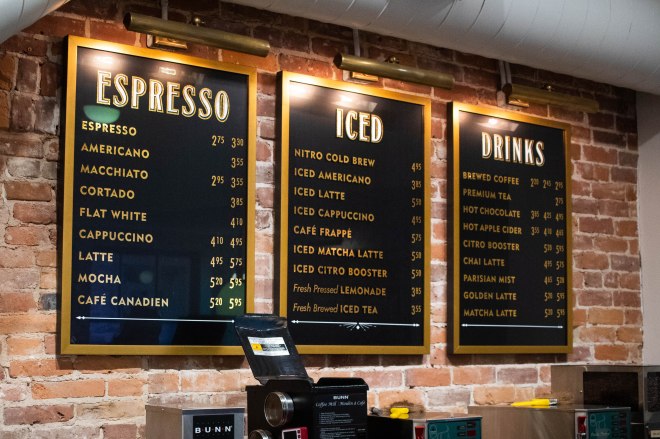
The founder of Balzac’s was inspired while in Paris to create a café of her own. You can see this inspiration showing through on the menu and packaging, fitting in today just as well as it would have in the roaring ’20s.
Crave Coffee House & Bakery
The second café was a bit more modern at first glance. The tall white sans serif typeface simply set on black expresses exactly what it needs to in a contemporary and minimal way. If you’re craving your coffee fix or to appease your sweet tooth, look no further.
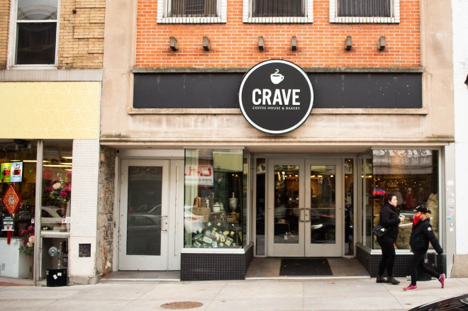

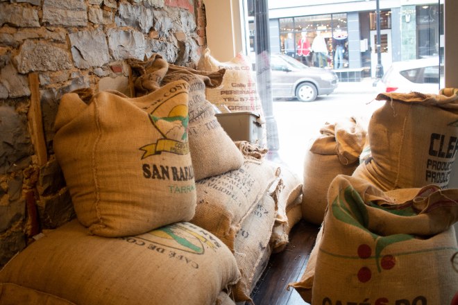
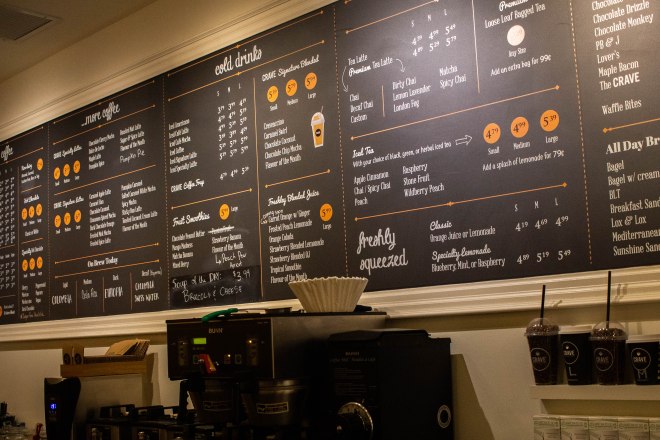
Once you get inside, there is a bit more of a blend between contemporary and rustic. Their logo is branded onto some wooden planks above the doorway and burlap sacs of what I can only assume are coffee beans are stacked in the corner. The menu then seems to bring in a whole other element out of nowhere with a playful script typeface. In my opinion, there’s a little too much going on in the context of typographic consistency but overall I suppose it’s still an inviting and admittedly tasty spot.
Barcadia
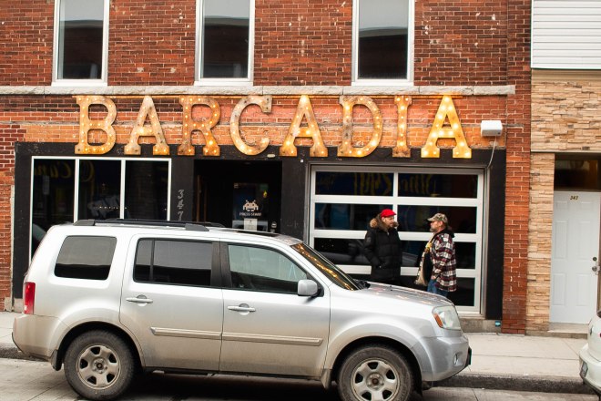
My favourite spot (and I’m fairly certain the only) in Kingston to grab some drinks and play pinball, at least on a real machine, is Barcadia. The sign is made of wooden slab serif letters with incandescent bulbs for a warm inviting glow as well as what I hope is an homage to the old school bulbs in pinball machines.
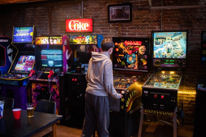
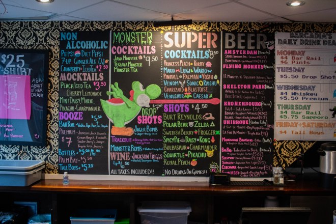
Barcadia is also undoubtedly home to my favourite hand drawn chalk menu. The vibrant colours and surprisingly effective hierarchy feel so perfectly suited to the atmosphere. The typefaces used on the daily drink menu on the right also have the same retro appeal as the sign out front as well as, of course, a pixel font.
The Grizzly Grill
Just look for the one with the massive bear head out front. The Grizzly Grill, affectionately known as “The Grizz”, plays the roll of a rustic restaurant up until around 10pm when it becomes a billiards bar, no complaints here. The sign out front is subtle but does capture the rustic tone of the restaurant really well. Oh and the bear probably helps too.
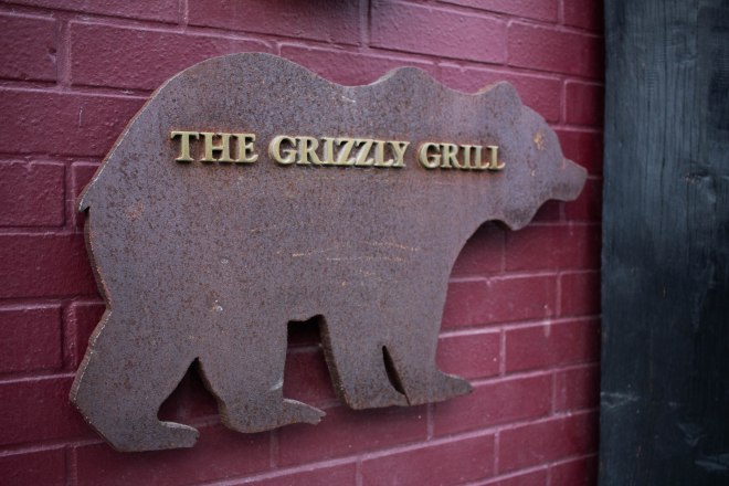
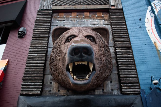
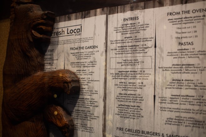
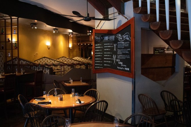
The atmosphere of the restaurant is definitely classic and rustic, and the food was delicious, three qualities they claim on a sign inside the door. If I’m going to be completely honest though, I think the menu design needs a bit of work. Centre alignment throughout is a bit strange and it doesn’t seem to make any attempt to capture the rustic element that is so heavily played upon throughout the restaurant.
Chez Piggy
One word to describe Chez Piggy, at least from the outside, is quaint. The original doorway nestled into the corner of the limestone building is the epitome of tradition in Kingston. The simple calligraphic logotype is the cherry on top of the already inviting entrance.
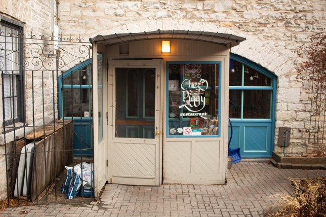
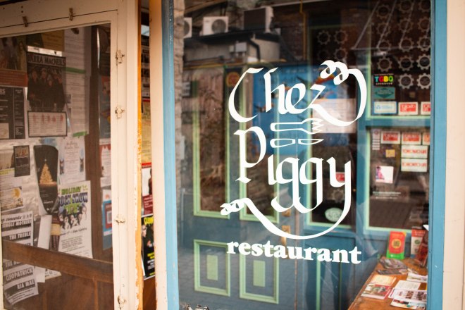
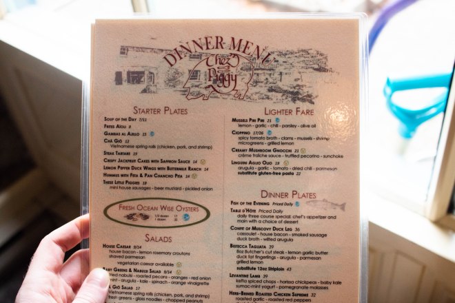
The no-nonsense menu also falls in line with the traditional appeal of Chez Piggy. The glyphic serif paired with the logo placed on a pencil illustration of the courtyard around the entrance is about as timeless as you can get.
The Works Gourmet Burger Bistro
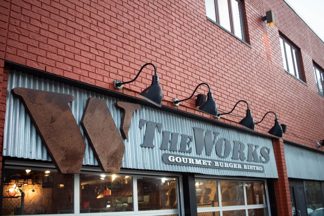
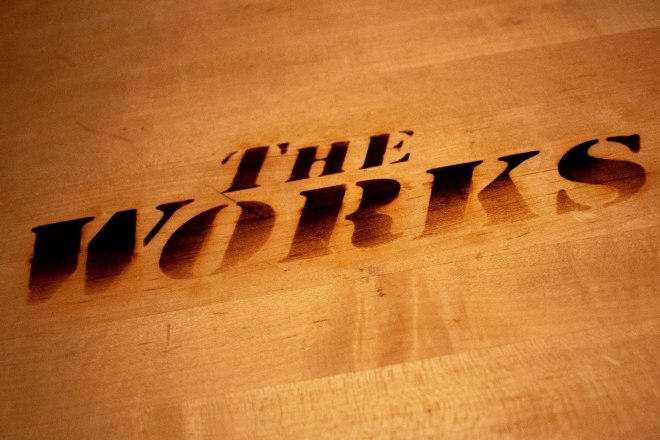
One of my favourite spots downtown is The Works. Partly because of their incredible burgers and great service but also partly because the atmosphere is so consistently upheld. From the sign out front, to the tables, to the piping along the walls, the entire place has an industrial element. The bold serif typeface on the sign is wood drilled into sheet metal, what more can I say.
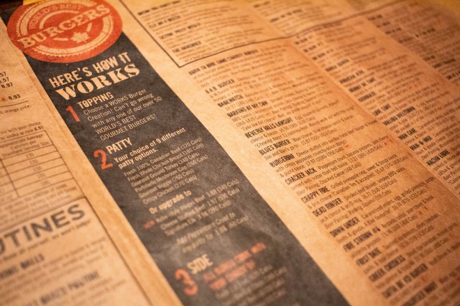
The selection on the menu is also ridiculously huge but they do a great job of using layout and hierarchy to create a system that makes it easier to digest (pun intended). The slight grunge of some of the heading also adds to the overall industrial tone.
Megalos
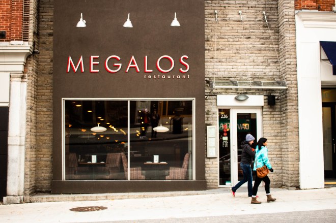
It’s tracked out, it’s thin, it’s all-caps, it’s dimensional. The sign is about as modern as it gets. The vertical black facade of the building coupled with the elegant typeface used does a great job of setting a more upscale scene. With floor to ceiling windows to show off the mood lighting before you even get in there.
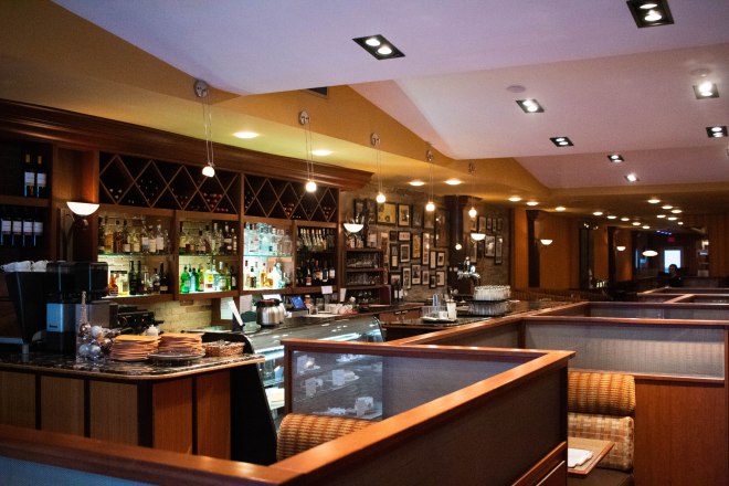
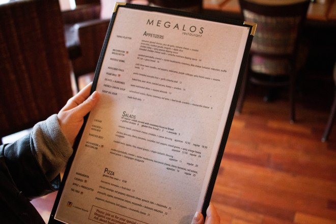
There seemed to be a bit of a disconnect between the hyper-contemporary appeal of the front of the restaurant and the feeling you got stepping in. It was far warmer and inviting inside than the sign out front made it seem. I somewhat expected the black, silver and red to be used more heavily inside to continue the contemporary aesthetic, perhaps tile floor or stainless steel counters. Instead there were warm tones in the patterns on the booth and lots of wood. The menu also fell a bit short in terms of giving off a highly refined, modern look.
Milestones Grill + Bar
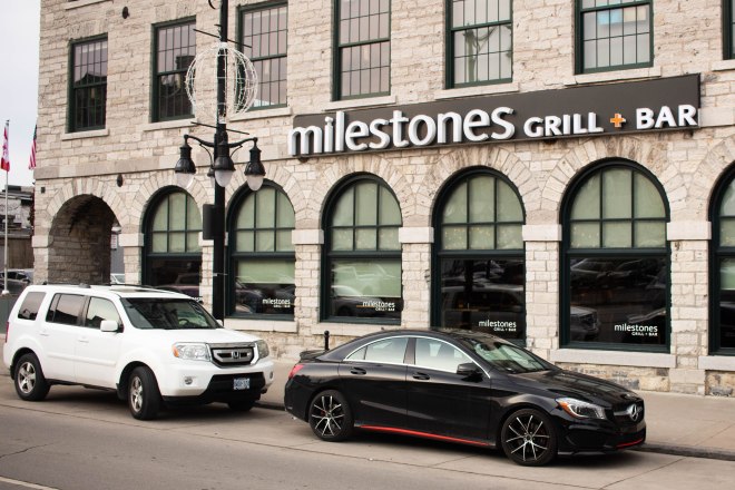
Maybe the custom rimmed Benz coupe out front gave it away but Milestones is fine dining. Their sign has somewhat of a modern appeal through it’s simple humanist sans serif application. Leaving the “m” lowercase feels more casual and welcoming which aligns with the choice of a humanist typeface.
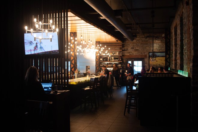
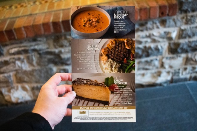
Ah, there are the black tiles and stainless steel chandeliers I was expecting to see at Megalos! Ironically enough the interior design of Milestones matches better with the typographic style of the Megalos sign, but I digress. The menu at Milestones was perfectly suited to the upscale atmosphere they were trying to achieve. The type overlaid on the full bleed photography felt fresh and modern, removing the need for whitespace allowed the overall deep tones of the images create their own mood. A subtle shadow was all that was needed to ensure the type was legible.
Full Belly Feelings
While this header would make a fantastic name for a restaurant it is sadly just the end of my tasty escapade through downtown Kingston. Overall I think the spots I visited used type effectively and accurately to portray themselves in a way that made sense within the context of their type of food. I admit I was expecting more variation between the type styles used for the menus in some of the restaurants however I may simply be misjudging their intended atmosphere. With all this said, I’m still not sure how many people consciously value typography when choosing where they eat although it seems to be one of the main factors in ensuring a consistent experience. I’ll be honest though, I’ll put up with a bit of inconsistency for some great food.