In today’s advertising world, we’re conditioned to understand the intended tone of a message even before it has been explicitly presented to us. Tapping into this capitalistic sixth-sense has been the goal of marketers all along but now that algorithms are involved we feel slightly more connected to the products. We’ve accepted targeted ads in lieu of pointless promotional pixels for things we couldn’t possibly see ourselves using. I will admit, amidst the clamouring for our attention it is nice to feel as if something is being promoted for a reason.

In my opinion, this feeling of connection is something that advertisers can use to their benefit in terms of creating apparent value, be it true or not. If we are presented with an ad that offers a sense of sophistication or elegance, is it not safe to assume we exemplify those same traits? Why would we have gotten that ad if it were unsuitable?
With that said, the relationship between the inherent tone and the product cannot be stretched too thin before it’s credibility snaps. Although a well chosen typeface can sure go a long way in making us feel comfortable thinning out our wallets on something that isn’t necessarily as “haute” as it wants to be. That’s where I come in!
Elegance is a strange beast (allow me to get poetic for a few). It can be found in simplicity, it can be found in extravagance, and some I’m sure would say it can be found in chaos. But what exactly is it that makes something elegant in the context of typography? It’s all in the stroke.

For some reason stroke contrast seems to be the biggest indicator of an attempted high-class appeal. Most likely developed through the years by magazines such as Vogue, Elle, and Bazaar, and nearly every abstract cologne commercial, we now recognize this typographic style as high-class.


Whether or not this convention can be broken or re-defined through brand development is a whole other topic but for now I’ll leave you with a few links to free typefaces you can use to add a little elegance to your designs. It is somewhat strange how these norms have the ability to change our impression so easily but so long as it works, work with it.
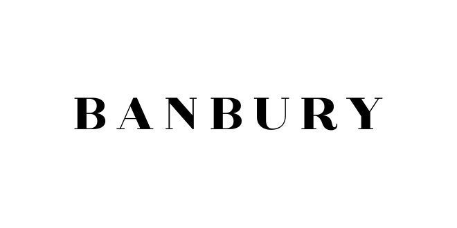 Banbury Font Download – Free Use Only