RGD Rules of Professional Conduct: A Student Perspective

As a student member of the RGD I’m learning more and more about what it means to be a part of the organization and how it will affect how I conduct myself in my career as a designer. The RGD has written 8 rules of professional conduct that outline the ethical expectations each member of the RGD must follow:

  1. I am committed to meeting the professional standards of the graphic design industry and working towards the betterment of the
    profession across Ontario, Canada, and internationally.
  2. I will engage in the practice, management, and/or instruction of graphic design in an ethical and lawful manner.
  3. I will act in the best interest of my clients and/or employers, within the limits of these Rules.
  4. I will act in the best interest of consumers and society wherever possible.
  5. I will meet financial obligations, respect lawful contracts, and be bound by provisions in all agreements.
  6. I will ensure I receive compensation for graphic design services that I provide except for pro bono work.
  7. I will respect the intellectual property rights of others.
  8. I will uphold my intellectual property rights unless I have negotiated a transfer of them to another party.

(https://www.rgd.ca/ethics)

Since I’m still in the very early stages of the RGD certification process, I haven’t had much real-world experience with each of these rules but it’s easy to recognize their necessity. Rule #4 however, “I will act in the best interest of consumers and society wherever possible.”, is one that I have considered during a student project and I’d like to give a brief overview of my process in an attempt to showcase how it may apply in a client-designer relationship. Of course, within the scope of a student project I was able to make decisions that would most likely receive pushback on an economic basis from a client/business. That being said, part of the rule seems to delve into our responsibility as designers to encourage sustainability and explore practical ways to implement it.

The objective of the project I’ll be overviewing was to redesign a package to improve some aspect of it we recognized as a flaw. I decided to redesign a pre-popped popcorn package on the basis of it’s material, aluminized plastic, used commonly for chip bags due to being inexpensive. Unfortunately, due to mixing metal and plastic during production, the bags can’t be recycled. If I had simply created a new visual design for the popcorn in the same material without suggesting and providing options for eco-friendly alternatives, I feel I would be violating Rule #4 by not acting in the best interest of society on an environmental basis. My solution for the redesign used primarily cardboard as an outer layer, and then had individual packs inside made from biodegradable plastic. This meant every part of the package could be recycled as long as the consumer was willing to separate the cardboard and plastic.

screen shot 2019-01-27 at 4.16.33 pm

screen shot 2019-01-27 at 4.16.42 pm

I’ll be graduating soon and the responsibility of following the RGD rules of professional conduct will become more heavily placed into my hands. It’ll be up to me to educate my clients on the importance of making choices with societal awareness as apposed to strictly economic benefit. In my opinion a company’s value comes from so much more than simply how much they make. As companies realize more and more the positive impact of presenting themselves as socially aware and upstanding, I think my responsibility to follow Rule #4 will get easier. My approach going forward, as it was for the popcorn package, will be to explore sustainable options from the start and implement them wherever I can.


RGD Rules of Professional Conduct: A Student Perspective

Foodie Fonts: An exploration of Kingston’s restaurant typography

Kingston, Ontario, proud home of the Tragically Hip, the Penitentiary Museum, Queen’s university, and enough restaurants to never have to cook again without ever eating anywhere twice. Okay, that may be a slight exaggeration but I’ve lived in Kingston my whole life and I’m still discovering new restaurants all the time. As someone who enjoys tasty eats (duh) but also a quality brand identity, I’ve decided to do a little “investigative journalism” on some of Kingston’s well known restaurants. Or is it just an excuse to stuff my face?

Yes. But I’ll also be doing a bit of review along the way. I want to see how restaurants are representing themselves in a typographic sense. Fine dining is without question a different world from food trucks or casual burger-n-pint type joints but how is branding, and more specifically typography used to set the stage for us food lovers. From their logos to their menus, and everything in between.

The four categories I’ll be looking at are cafés, casual dining, pubs, and fine dining. Hopefully throughout my journey you’ll discover some places to try out if you’re ever in Kingston! Or if you’re just interest in typography and branding, then there’s definitely some spots around town that I’m excited to review. Either way, keep reading for an interesting take on restaurants and how their typography tells a story about the experience just as much as their food. The type and tables are set, cravings guaranteed.

Balzac’s Coffee

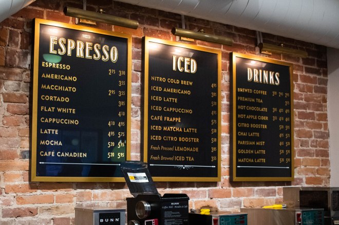
The first café I visited was called Balzac’s. There’s an interesting mix of typefaces used on their storefront. A traditionally appealing glyphic serif on the canopy paired with a tracked all-cap geometric sans lets us know they’ve been around a while but are still up with the times.

Balzacs1

Balzacs3

Balzacs4

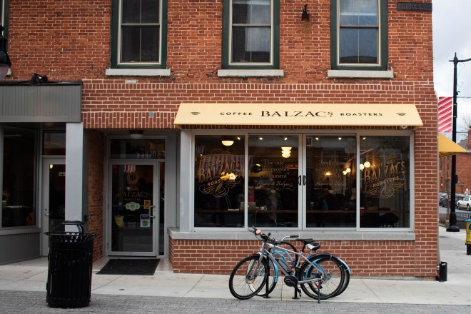
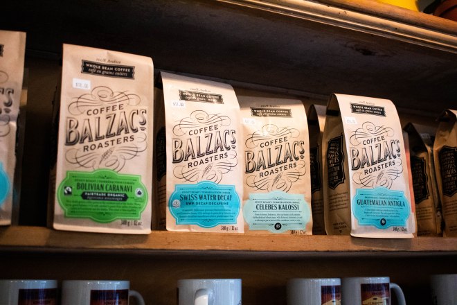
The founder of Balzac’s was inspired while in Paris to create a café of her own. You can see this inspiration showing through on the menu and packaging, fitting in today just as well as it would have in the roaring ’20s.

Crave Coffee House & Bakery

The second café was a bit more modern at first glance. The tall white sans serif typeface simply set on black expresses exactly what it needs to in a contemporary and minimal way. If you’re craving your coffee fix or to appease your sweet tooth, look no further.

Crave1

Crave4

Crave3

Crave2

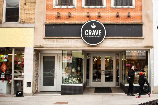
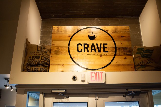
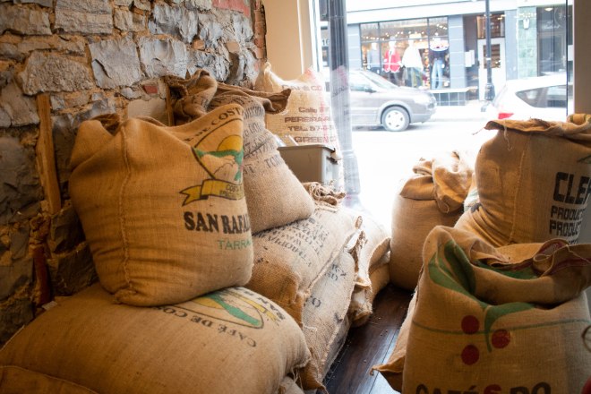
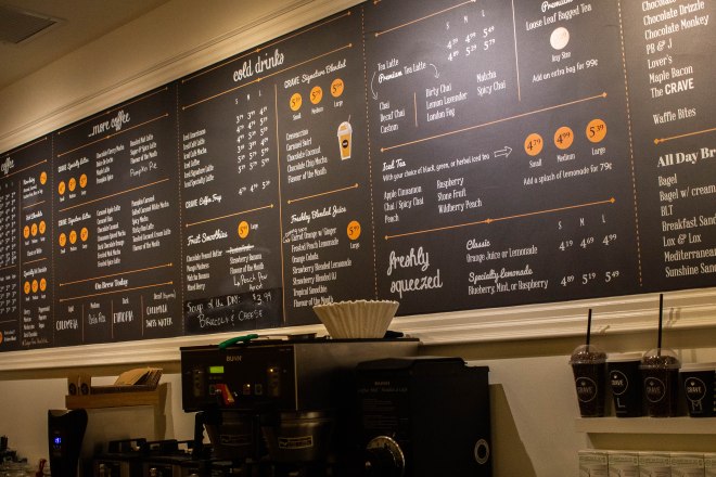
Once you get inside, there is a bit more of a blend between contemporary and rustic. Their logo is branded onto some wooden planks above the doorway and burlap sacs of what I can only assume are coffee beans are stacked in the corner. The menu then seems to bring in a whole other element out of nowhere with a playful script typeface. In my opinion, there’s a little too much going on in the context of typographic consistency but overall I suppose it’s still an inviting and admittedly tasty spot.
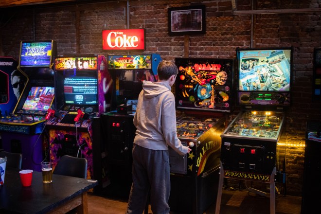
Barcadia

My favourite spot (and I’m fairly certain the only) in Kingston to grab some drinks and play pinball, at least on a real machine, is Barcadia. The sign is made of wooden slab serif letters with incandescent bulbs for a warm inviting glow as well as what I hope is an homage to the old school bulbs in pinball machines.

Barcadia1

Barcadia3

Barcadia2

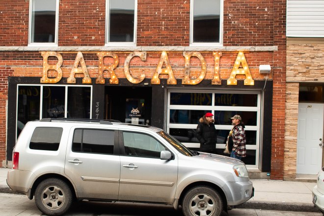
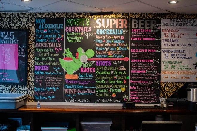
Barcadia is also undoubtedly home to my favourite hand drawn chalk menu. The vibrant colours and surprisingly effective hierarchy feel so perfectly suited to the atmosphere. The typefaces used on the daily drink menu on the right also have the same retro appeal as the sign out front as well as, of course, a pixel font.
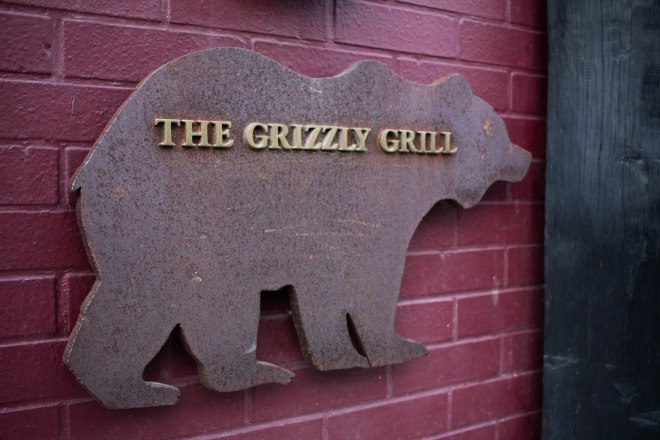
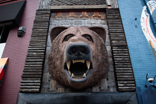
The Grizzly Grill

Just look for the one with the massive bear head out front. The Grizzly Grill, affectionately known as “The Grizz”, plays the roll of a rustic restaurant up until around 10pm when it becomes a billiards bar, no complaints here. The sign out front is subtle but does capture the rustic tone of the restaurant really well. Oh and the bear probably helps too.

Grizz1

Grizz2Grizz3

Grizz5

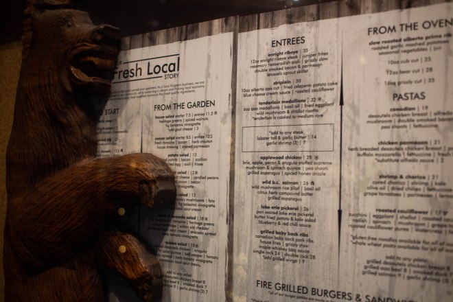
The atmosphere of the restaurant is definitely classic and rustic, and the food was delicious, three qualities they claim on a sign inside the door. If I’m going to be completely honest though, I think the menu design needs a bit of work. Centre alignment throughout is a bit strange and it doesn’t seem to make any attempt to capture the rustic element that is so heavily played upon throughout the restaurant.
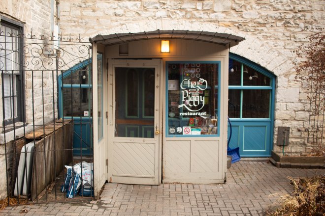
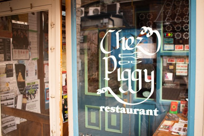
Chez Piggy

One word to describe Chez Piggy, at least from the outside, is quaint. The original doorway nestled into the corner of the limestone building is the epitome of tradition in Kingston. The simple calligraphic logotype is the cherry on top of the already inviting entrance.

ChezPiggy1

ChezPiggy2

ChezPiggy3

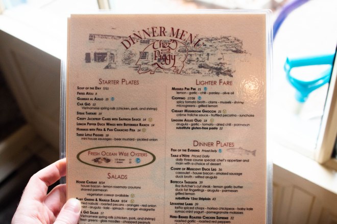
The no-nonsense menu also falls in line with the traditional appeal of Chez Piggy. The glyphic serif paired with the logo placed on a pencil illustration of the courtyard around the entrance is about as timeless as you can get.

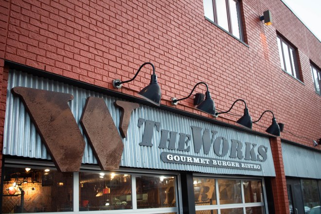
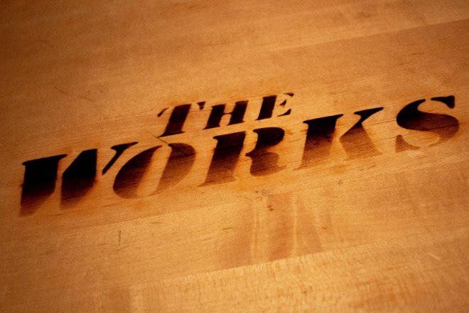
The Works Gourmet Burger Bistro

One of my favourite spots downtown is The Works. Partly because of their incredible burgers and great service but also partly because the atmosphere is so consistently upheld. From the sign out front, to the tables, to the piping along the walls, the entire place has an industrial element. The bold serif typeface on the sign is wood drilled into sheet metal, what more can I say.

Works1

Works2

Works3

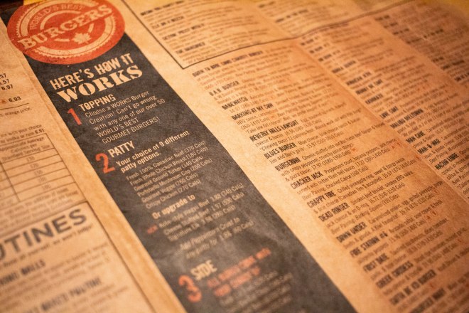
The selection on the menu is also ridiculously huge but they do a great job of using layout and hierarchy to create a system that makes it easier to digest (pun intended). The slight grunge of some of the heading also adds to the overall industrial tone.

Megalos

It’s tracked out, it’s thin, it’s all-caps, it’s dimensional. The sign is about as modern as it gets. The vertical black facade of the building coupled with the elegant typeface used does a great job of setting a more upscale scene. With floor to ceiling windows to show off the mood lighting before you even get in there.

Megalos1

Megalos3

Megalos2

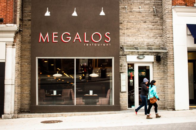
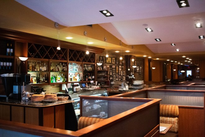
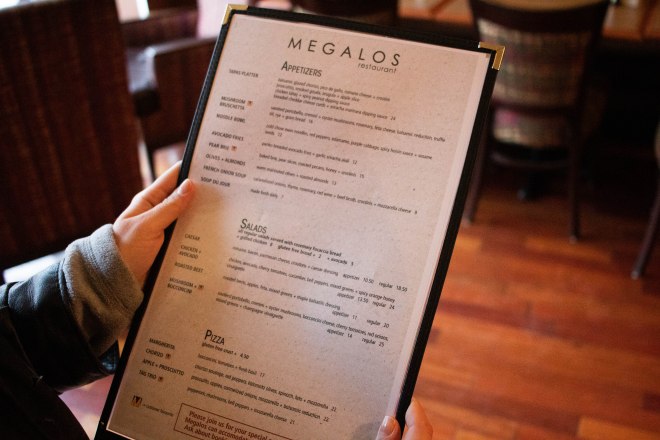
There seemed to be a bit of a disconnect between the hyper-contemporary appeal of the front of the restaurant and the feeling you got stepping in. It was far warmer and inviting inside than the sign out front made it seem. I somewhat expected the black, silver and red to be used more heavily inside to continue the contemporary aesthetic, perhaps tile floor or stainless steel counters. Instead there were warm tones in the patterns on the booth and lots of wood. The menu also fell a bit short in terms of giving off a highly refined, modern look.

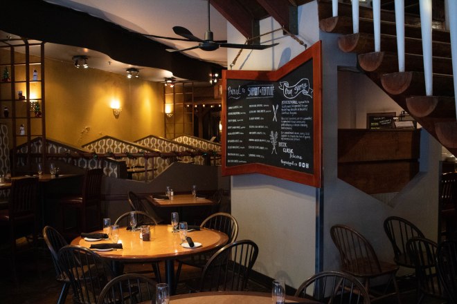
Milestones Grill + Bar

Maybe the custom rimmed Benz coupe out front gave it away but Milestones is fine dining. Their sign has somewhat of a modern appeal through it’s simple humanist sans serif application. Leaving the “m” lowercase feels more casual and welcoming which aligns with the choice of a humanist typeface.

Milestones1

Milestones5

Milestones2

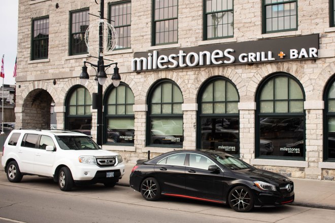
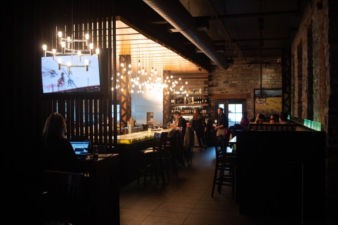
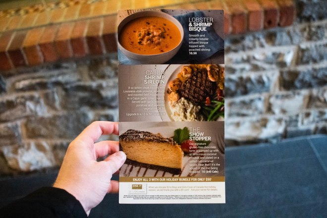
Ah, there are the black tiles and stainless steel chandeliers I was expecting to see at Megalos! Ironically enough the interior design of Milestones matches better with the typographic style of the Megalos sign, but I digress. The menu at Milestones was perfectly suited to the upscale atmosphere they were trying to achieve. The type overlaid on the full bleed photography felt fresh and modern, removing the need for whitespace allowed the overall deep tones of the images create their own mood. A subtle shadow was all that was needed to ensure the type was legible.

Full Belly Feelings

While this header would make a fantastic name for a restaurant it is sadly just the end of my tasty escapade through downtown Kingston. Overall I think the spots I visited used type effectively and accurately to portray themselves in a way that made sense within the context of their type of food. I admit I was expecting more variation between the type styles used for the menus in some of the restaurants however I may simply be misjudging their intended atmosphere. With all this said, I’m still not sure how many people consciously value typography when choosing where they eat although it seems to be one of the main factors in ensuring a consistent experience. I’ll be honest though, I’ll put up with a bit of inconsistency for some great food.


Foodie Fonts: An exploration of Kingston’s restaurant typography

Future of the Past

Everything is moving so quickly nowadays that reaching for the future seems to be a natural choice when attempting to create designs that enter new territory and shake up the norms. What’s ironic about this is that attempts at being futuristic as a typographic style often feel more like Bladerunner fan art than an attempt at reimagining contemporary norms. This article from Fabrik speaks to the undying appeal of nostalgia in advertising and the same is true for typography. Funny thing is, the further back you go in the type timeline, it seems more and more evident that the future will be based in the unwavering success of the past. Enter Fortunado Depero.

Fortunado-Depero-01.jpg    Fortunado-Depero-02

Above are snapshots from the book Typology: Type Design from the Victorian Era to the Digital Age. The periodical cover on the left was designed in 1929 by Mr. Depero himself. The periodical cover on the right is from 1933 from an unknown designer, but it undoubtedly draws from the Futurist type style coined by Depero years prior. At the time, technology and society were undergoing revolution. Type, as it does, followed right along. The speed and sound of the newly emerging lifestyle were expressed in everything from advertising to book design. But what does this have to do with today?

Digital media has transformed the way trends are set and drastically increased the speed at which they are realized and replaced. Like Fortunado in the ’20s, creating something new is about expressing the line between the contemporary and whatever uncertainty and excitement is waiting to consume the masses ahead of it. Design becomes a driving factor for how society feels about whatever trendy new tech, product, or service is next and that appeal is measured to redefine it’s competition.

The sheer variety across the history of typography even just within the 1900s speaks to it’s capacity for defining a specific tone and reaching to push boundaries. As new trends form, staying ahead can be tough but never be a afraid to look back at what’s worked in the past to create the future.


Future of the Past

Helvetica. Enough said.

You may not be a designer, you may not even notice how design influences the world around you, but I know for a fact you’ve still seen Helvetica. There probably isn’t an industry that hasn’t been graced with it’s no-nonsense simplicity and sans-serif effortless effectiveness. I may be slightly biased, having used it frequently myself, but the weird thing is I couldn’t tell you why I’ve developed such a fondness for the family. Neue or not, condensed or extended, give me a project and I’ll find a way to work it in somehow. Okay, not quite, but I am under the impression that if for some reason everyone had to suddenly switch to only using Helvetica the world wouldn’t be all that worse off (sorry calligraphers). Pulling back to reality though, it is quite amazing the versatility behind the brands that have put this timeless typeface to use. I figured I’d take the time to showcase a few of my favourites and perhaps figure out why it appeals to me so much. Maybe from here on out I won’t be the only one asking “is that Helvetica?”

Helvetica-Logo-Collage1

Believe it or not, all of the brands above are using the same font. They clearly don’t represent the same values or sell the same products, but Helvetica is there, no questions asked. This isn’t nearly all of them either, here’s a gallery of even more examples! To narrow it down however, I figured I’d focus on clothing, “apparel” as it were. North Face, American Apparel, Bench, and Off-White all use Helvetica with little addition, allowing the letterforms to create a form of their own which over time become attached to the brand and then to us.

1280px-Off-White_Logo.svg

Virgil Abloh, the creative director of Off-White has built an entire identity surrounding Helvetica. With the help of a little bit of tasteful irony, he uses single word quotations to create some of the most sought after pieces in the apparel industry. In my opinion, he’s a genius, and not just for using Helvetica. I don’t know how much it helped but I do know it wouldn’t be as recognizable if he ever switched it up. Lots of brands are moving away from Helvetica in favour of their own typefaces but I don’t think it matters. It has gained it’s legacy through adaptable simplicity and nothing can take that away.

I leave you with the best examples of Helvetica c/o Off-White c/o Virgil Abloh:


Helvetica. Enough said.

The Quest for Class: Elegant Typefaces

In today’s advertising world, we’re conditioned to understand the intended tone of a message even before it has been explicitly presented to us. Tapping into this capitalistic sixth-sense has been the goal of marketers all along but now that algorithms are involved we feel slightly more connected to the products. We’ve accepted targeted ads in lieu of pointless promotional pixels for things we couldn’t possibly see ourselves using. I will admit, amidst the clamouring for our attention it is nice to feel as if something is being promoted for a reason.

irl_targetad

In my opinion, this feeling of connection is something that advertisers can use to their benefit in terms of creating apparent value, be it true or not. If we are presented with an ad that offers a sense of sophistication or elegance, is it not safe to assume we exemplify those same traits? Why would we have gotten that ad if it were unsuitable?

With that said, the relationship between the inherent tone and the product cannot be stretched too thin before it’s credibility snaps. Although a well chosen typeface can sure go a long way in making us feel comfortable thinning out our wallets on something that isn’t necessarily as “haute” as it wants to be. That’s where I come in!

Elegance is a strange beast (allow me to get poetic for a few). It can be found in simplicity, it can be found in extravagance, and some I’m sure would say it can be found in chaos. But what exactly is it that makes something elegant in the context of typography? It’s all in the stroke.

Bazaar_Cover

For some reason stroke contrast seems to be the biggest indicator of an attempted high-class appeal. Most likely developed through the years by magazines such as Vogue, Elle, and Bazaar, and nearly every abstract cologne commercial, we now recognize this typographic style as high-class.

armani_cologne dior_classy

Whether or not this convention can be broken or re-defined through brand development is a whole other topic but for now I’ll leave you with a few links to free typefaces you can use to add a little elegance to your designs. It is somewhat strange how these norms have the ability to change our impression so easily but so long as it works, work with it.

banbury.pngBanbury Font Download – Free Use Only

edition.pngEdition Font Download


The Quest for Class: Elegant Typefaces

How Not to Hate Your Workplace

As a college student, I’ve had my fair share of jobs I didn’t really want nor see myself continuing long enough to feel ambitious in my position. It was never just me either,
but that’s no surprise. You can only work so many 11pm-7am shifts amongst a broken nocturnal sleep schedule before you begin evaluating the true importance of straightening pickle jars at 3:48am on a Tuesday.

The revelation: a workplace is so much more than the space it uses.

Fast forward to last summer, ah, feel the sun on your cheeks. Or is that the glow of a personally fulfilling position in a field I’m passionate about? Either way, I’ll take the feeling over pickles. I was fortunate enough to work with the marketing department at St. Lawrence College as part of a student bursary employment opportunity assisting the head Graphic Designer at the time (s/o Vince Perez, Everlovin’ Press). The marketing team of 3 and 2 students performed like a powerhouse, with large scale projects undergo throughout my few months with them all while one or two-day tasks would flood in on top. There was a consistency that couldn’t seem to be broken. I came to realize the power of collaboration between people who are all passionate and striving for a common goal. It was independent only ever as a means of advancing the team’s progress.

To me, this is how workplaces should feel. Not as if you are trapped into completing a
to-do list alongside like-minded coworkers while they independently fulfill their responsibilities. Instead, let teamwork and collaboration create an atmosphere where the sum is greater than it’s parts. Grow through each other’s experience and in turn grow as a team. Common goals equal common good through communication and effort. Loving your workspace is about learning to love the people you work with, or at the very least learning to love what they do by understanding how they work and how you can work together.

How Not to Hate Your Workplace

Design Process: Man and Machine Conference

Background

The Man and Machine Conference brings together researchers working on the foundations of robotics, robotics applications, artificial intelligence, autonomy, and analysis of robotic systems and automation. The conference allows participants to see the best research in all areas of robotics.

Objective

The objective for the conference was to attract local and regional attendees to the conference who are interested or have a stake in the future of robotic design, emerging technologies and application. The project objective was to create a consistent conceptual style across various marketing applications.

Strategy

The target audience includes engineers, manufacturers, designers and inventors who are interested in supporting and learning about the rapidly advancing and innovative technologies. The key message was to explore the challenges facing advancement, production, and interaction with robotic machine in the 21st century from a scientific standpoint.

Tone and Character Key Words: Technology, programming and development, innovation, automation, AI, human-machine interface.

The first step of the process was exploring the themes and any visual concepts that could express the key message and intended tone. I started by making a mind map around robots and then did some quick logotype sketches to explore different tones.

ManAndMachineMindmapManAndMachineTypeSketches
Concept Mindmap & Logotype Exploration


ManAndMachineSketches
Poster Thumbnail Sketches

The overarching concept that I decided to carry through the entire campaign is man and machine’s ability to work together. The illustrations were used to visually represent this relationship and show that people and machines work collaboratively in today’s industries. The style of the robotic arm takes inspiration from the yellow industrial robotic arms used for automobile assembly and various factory tasks. Having the man dressed in stereotypical work attire shows both of them are hard at work cooperatively on the same project. Using an industrial robot will also resonate strongly with the engineers and manufacturers who will be attending. Textures were also used to extend the concept beyond the main illustrations; a fingerprint for people and circuitry for robotics.

RoboticsLogo

RoboticsSpread

The final design solutions advertise the conference in an exciting and eye catching way. The overall concept is expressed through illustration and the visual style allows the campaign to feel consistent across all the various applications.

Design Process: Man and Machine Conference

Future Type (but not Futura)

For the past few decades in the design world there have been a handful of all-star heavy hitter typefaces that seem to find their way into everything. Typefaces like Helvetica, Futura, DIN, and Bodoni, to name a few, can be found in any possible application you could think of. Brands have also relied on the familiarity of these classic typefaces to secure a recognizable identity that can easily be extended into other aspects of their branding. For example, American Apparel recognizably uses Helvetica, and Supreme uses Futura.

american-apparel-logosupreme_logo

These typefaces have been immensely successful through presenting themselves in a sort of all-you-can-type way. They’re designed to work as seamlessly as possible with any design by letting the visual elements remain the focal point, but also are appealing enough to hold their own in a composition. With that said, is the future of typography different from the heavy-hitter typeface crazy of the past few decades? In my opinion, yes.

Nowadays, typefaces aren’t only being designed by established foundries. Designers all around the world are personally creating new and increasingly modern looking typefaces. With the new wave of downloadable typefaces and the amazing variety they present, designers are now able to achieve an even higher level of uniformity through the type choices. Typefaces are being increasingly used to portray their own message, instead of relying on accompanying graphics.

screen-shot-2016-10-22-at-12-54-27-pm

For example, Lombok is a sans-serif typeface designed by Alexandre Pietra (Available here: http://www.kreastudio.ch/lombokfont). With just one look at the typeface, it’s minimal, futuristic sophistication shows through. Without even presenting it alongside any other design elements it gives off a distinct mood and tone to the viewer. With so many unique typefaces available online, designers are now able to tailor their typeface choices more accurately to fit their intended message. Typefaces are more accessible than ever before, good, bad, and ugly, so choose wisely. The perfect solution could be just a click away! Check out 1001fonts.com for some amazing downloadable fonts.


Future Type (but not Futura)

What does success look like to me?

In such a fast paced competitive society, success is something we’re all inherently programmed to strive for in one sense or another. Ever since I was a kid, they were teaching us the steps for reaching success, or at least the cookie cutter model of success in the western world. I was taught to achieve high marks in school so I could move on to post-secondary education, then graduate and secure a job in my desired field. I felt that if I could do all this, it would make me successful, which isn’t wrong however I feel it’s slightly lacking in terms of what success really means.

succes.jpg
“You define your success.”

To me, success is more part of the journey than it is the destination, cliche as that is. What I mean by that is someone’s success shouldn’t be defined by how far they have already been able to come, but instead by how many obstacles and hurdles they have successfully overcome to get to wherever they are. In my opinion true success means persevering with something until you are able to achieve your goal, no matter how small that goal is, and then setting a new goal to continue working towards. For tips on setting your own powerful goals, visit: http://www.success.com/article/rohn-4-tips-for-setting-powerful-goals)

Success can be reached by anyone who is willing to set their goals and put in the hard work it takes to chase them. Every single milestone towards your goal makes you successful, so the only truly unsuccessful people are those who chose to give up after reaching an obstacle. You define your own success by the goals you set and actions you take to reach them, so what’s stoping you, go get to work!

What does success look like to me?

Blogging about Blogging

At the beginning of this semester I found out I would be creating a blog to write about different aspects of typography. Initially I was excited because I’ve always loved using type in creative ways, but have never actually researched too much about it. I thought the blog would give me a good reason to start learning even more about type!

Blog-image_2

As a class, we were going to be given five topics to write about, which was great, but I thought I’d want to do even more. Once the semester was underway, the challenges of blogging became more apparent my enthusiasm slightly dwindled. The biggest challenge for me was time. I very much enjoyed the writing and production aspects of the blogging, but will all my other course projects it seemed to fall to the end of my to-do list.

My best advice for overcoming the time crunch is creating new posts in parts. Start by conceptualizing the topic and thinking of some sub-headings or a basic structure. This part can be done during during a commute or while cooking so that by the time you actually dedicate time specifically to your blog, all your effort can go directly to writing it.

Breaking up a blog post into different components can make it feel a lot less daunting and completing them separately. For example, research, format, media and finally text can all be created at different times and combined for the final post.

The most important thing I learned about type this semester was the scale of the industry. Before, I always thought of typography as simply the way words are formatted. Through my research for various projects and blogs, I’ve become aware of the massive industry behind typography. Typeface design, print production, web type, art type, marketing and so many other fields are directly related to typography and it’s intricacies.

It’s fascinating to see the type rules I have learned this year being used in so many different applications. Admirably,  I’ve become somewhat of a type-nerd, offering up critiques of advertising or menu’s at restaurant to my uninterested friends who waste no time returning to their conversation about hot sauce. The point is I’m now consumed by the invisible (or often not) precision of typography, and look forward to everything else I’ll be able to learn from here on.


Blogging about Blogging